butterflies for mom

Mom has been my greatest supporter, and the biggest collector of my work. These butterfly dessert plates are to go with her set of tea cups:

typography trays: in process


For the first time ever I am making typography trays for a store (that same one in L.A.). I’ve only made a few of them in the past, four or five in total, I think. This is because they are a pain to make: I practically have to stand on my head, hold my breath, and say many incantations. My acrobatics seem to be working, and I’m super excited to have twenty (yes twenty) of them ready to ship out in a few weeks. Above the trays are pictured in their ”bone dry” stage, awaiting to be bisque fired.

still life saturday with photographer Hallie Burton


All photography courtesy of hallieburton.com. Thank you to Denise Randolph for introducing me to Hallie’s work.

Visit Hallie Burton’s website.

on press

It’s been years since I have been “on press” to see a print job run. Back in my small design studio days, if the job was a book, for example, going on press was torturous. It entailed a lot of waiting around for the press to get up to speed, for all the dust to be removed, for the color to be balanced. It’s really an art running the offset presses, and it is fascinating to watch. Today’s press run was simple, one color, small business card, a breeze. Big thank you to Richard at Colonial Printing for making it all super easy. Here are the results:

Karen’s card is so bright, it pops out in the midst of all this machinery.

We spent a bit of time getting the color saturated (a juicy raspberry pink), and the ink coverage as even as possible on an uncoated paper stock.

I love press proofs, with all the bleed and crop and registration marks. A good way to start out the day.

study of light: pawtucket: 06.23.10


Next Wednesday I will be saying goodbye to this view. I will miss it. Moving is a difficult thing, but necessary. See previous “Pawtucket light” studies here.

in great etsy company

Today was a great etsy day. Two of my pieces were featured on the front page. But, most importantly, they were among some of my favorite artists. Here are a few, click on the name to go to the shop:

This is just to name a few! Go etsy.

roly poly bowls: the hot summer accessory


Thank you to InStyle for featuring roly poly bowls to serve my favorite food! I love the deck: “Style is not just about what you wear.” So true...

Photographed by John Kernick.

pretty bethanie


I am working on a large order for a store in L.A., and Bethanie the kiln has her work cut out for her. She has to bisque and glaze fire about 200 pieces in the next few weeks. Good luck, pretty Bethanie.

thank you southern flourish and knack studio

Big thank you to Barb, from Knack Studio, for including gleena grass serving plates in her Southern Flourish article on nature-inspired decor. See the full article on the magazine’s pages 108-111.

for the love of food, photography, writing, and long summer afternoons with friends and family


all photography courtesy of Tartelette

Thank you to Helen who writes, photographs, and styles a beautiful blog, Tartelette, for using gleena plates to serve delicious and gorgeous summer meals. Read all about her family’s tasty gatherings in the South of France here.

monogrammed wedding set

A wedding gift with the couple’s initials on the two larger bowls, and their daughter’s initials on the smallest.

the invasion of alien flowers

Five of these lovely creatures have sprung from one of my plants. They range from one to two inches in diameter. The tiny round beads at the tip of each petal are syrup-y dots of liquid. I am amazed at this perfect geometry.

geninne’s nature-inspired collection

Geninne D. Zlatkis’ watercolors continue to inspire. This particular drawing makes me want to create a five-piece place setting, each dish with a different natural element in the center: a piece of corral, a pebble, a beetle, two feathers, a piece of fern, and a leaf.

This summery watercolor is available on Geninne’s etsy shop.

dishes for su

My very good friend Su and I designed dishes together that match Su’s new house as well as Su’s personality. Su is an elegant woman with sophisticated taste and a love of fashion. She also has a great sense of humor and a very casual, playful attitude to life. The set combines all aspects of Su’s persona by using white, a lovely warm gray and a joyful yellow, with a mix of polka dots. Plus fun sayings of foods Su loves and illustrations of shoes.

The table place setting has a formal white platter, an elegant warm gray salad plate, a happy yellow dessert plate with a shoe illustration on it, a fun polka dotted soup bowl, and a tea cup imprinted with letters that stand for things like "hot sauce" and "mom’s macaroni and cheese".

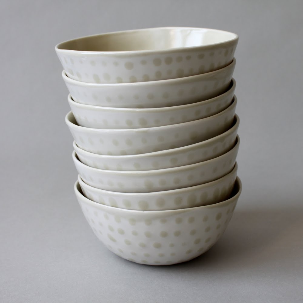
I love the way the soup/cereal/yogurt/oatmeal bowls stack up. They immediately put me in a good mood. We made these more casual so they can be used for breakfast, lunch or dinner.

Su is a big fan of shoes, think Carrie on Sex and the City. We found fun sketches of different shoes on istock, and purchased them for one time use.

The tea cups (or ice cream cups) are for after dinner conversations, and are inscribed with pieces of information not commonly known about Su. One saying "D is for sticky ‘date’ cake" is a good conversation starter. I don’t even know the full story behind that one.

The serving dishes are gray on the inside and white on the outside.

Chloe is Su’s Maltese and Yorkshire mix, and has her own dishes to match the set. One for water, the other for food.

I love the combination of Su’s style and gleena aesthetic that this set embodies, creating a one of a kind collection.

coleman and gigi


This past weekend, I took care of my neighbors’ cats, Coleman and Gigi, and was inspired to make them personalized food bowls. Now they know exactly which bowl to eat out of...